Problem
Lymphoedema is a long-term condition most newly-diagnosed patients have to research themselves. The practices treating it usually have medical-template sites: heavy, slow, full of stock imagery that builds no trust. NLLP's old site did the same, and enquiries were only occasional.
The business goal was a small but excellent site that turned more of those anxious researchers into enquiries: clear about what the practice treats, easy to contact, and fast on a phone in a waiting room.
Process
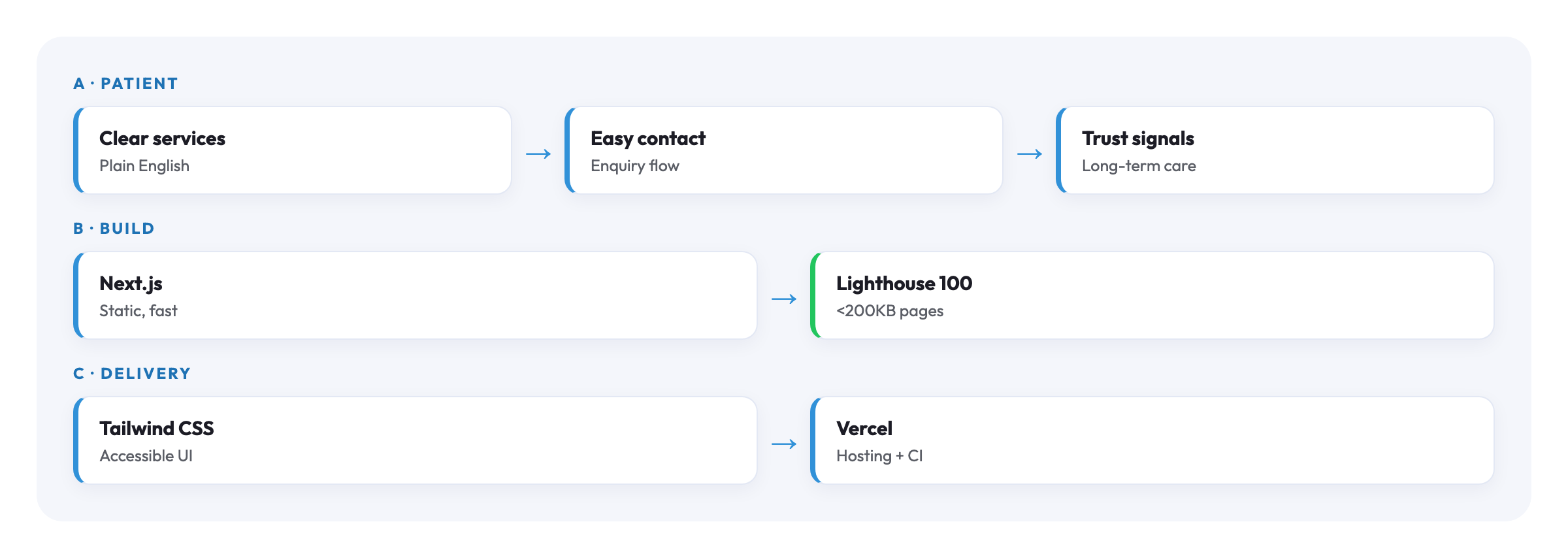
Run with the lead clinician, the decision that set the direction was content-first: work out what a patient needs in the first 30 seconds before designing anything. We mapped every route through the site toward one of two outcomes, "I've booked" or "I understand whether this practice is right for me", and left out everything that didn't serve them.
- Information architecture around the patient's question. What do they want to know, then what do they want to do? Everything pointed at those.
- Content first, then design. I drafted plain-English body copy with the clinician before any visual work; the design followed the words.
- Performance and accessibility as conversion features. Patients use this on mobile, often older devices, sometimes with reduced motion or larger fonts, so minimal JavaScript, semantic HTML, full keyboard navigation, and reduced-motion support, because a site that won't load loses the enquiry.
Outcome
Patient enquiries through the site went from occasional to a steady weekly flow: the same visitors, far more of them getting in touch. The site launched in under two weeks of design, build and content, and scored 100 across performance, accessibility, best practices and SEO.
"Enquiries used to be a trickle. Now they come in every week, and people arrive already understanding what we do."
Lead Clinician
Architecture